Good site structure: the basic rules for internal linking
Website architecture is about construction design and choosing the right facilities to build a site. Web pages are the building blocks, and structural internal links, like menu or sidebar ones, are the cement mortar. The role of electrical wires and other engineering utilities is played by cross-linking panels like "Related Products" or "Similar Articles". Arranging individual rooms into apartments is made easy with contextual links.

Tiago Celestino, CC BY 2.0, via Wikimedia Commons; modified
Site architecture is different from website design, which usually refers to designing page layouts. A good web developer will choose layouts that naturally fit the structure of your site, but this is not the case with online site builders.
Why should you care about good website architecture? Because constructional flaws can force you to constantly redesign the site and, in the worst scenario, make it impossible to achieve any ambitious SEO goal.
How to create an architecture for different types of websites
Do you think website creation should start with the homepage design? Not so fast. The first stage of building a website is keyword research, and the success of the entire project depends on the quality of this work done. So, let’s break down point by point how the collected keywords determine the structure of your future website. The to-dos are:
1. Collect as many keywords as possible, using any available tool:
- Keyword Planners from the major search engines;
- Omnibox suggestions in Search (Google, Youtube, Bing, etc.);
- AI chatbots like ChatGPT (specify the seed keywords and ask it for related phrases);
- KeywordTool (recommended; you can select your language and country), WordTracker, Seoscout;
- Ubersuggest and AnswerThePublic for questions;
- Google Trends, which shows the most topical keywords;
- ScientificSeller, an amazing tool that collects commercial keywords from Amazon;
- Google Search Console, Yandex and Bing Webmaster Tools, tied to one of your topic-related sites.

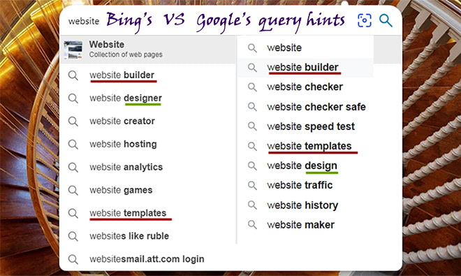
How different Google’s and Bing’s keyword hints are
2. Analyze your competitors. Get a list of their organic and advertising keyword phrases. For free, you can only do this by examining their landing pages and the corresponding SERPs. If you have a reasonable budget, choose any of the big-name SEO tools: Semrush, Serpstat, or SpyFu. These three are great and can be tried for free. There is also the free Moz Competitive Analysis Tool, but it can only say something useful about large websites with prominent rankings.
3. Cluster the keyword universe. That is, break it down into thematic subsets, keeping in mind the intent behind the queries. The point is that each keyword phrase is likely correlated with a certain user need that the search engine seeks to satisfy. For example:
- “How to tie a tie” is an informational query; the intent is to know;
- “Coca-Cola website” is a navigational key; the intent is to find;
- “Coffee near me” is a transactional keyphrase; the intent is to cheer up:).
There are many keyword clustering tools, but here I’ll mention only these two: Serpstat Clustering and Keyword Insights. If you use something else, it would be great if you shared your experiences in the comments. Whatever tool you choose, be sure to review and control the result given by the program.
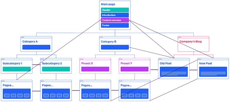
4. After you have clusters ready, plan a number of hub pages, including categories and pillar pages with cornerstone content. Depending on what type of site you’re creating, think about how to access the hubs from the home page. For example, let’s start planning the architecture of an e-commerce site.
If you have an online store, your categories must be listed in the navbar. Subcategories and preset filters should be available either from the navigation or from the sidebar, but all informational sections could be hidden behind a link with the anchor text “Blog”. Except for some pillar posts with contextual links to other pages that should be available from the content of the main page.
But if you’re creating an author’s blog or a photo portfolio, you might decide to make the main element of the homepage a tag cloud with links. But don’t clog it up like in the image below, or no one will be able to use it.

5. Consider which hubs the dead-end pages (supposed to be conversion or transactional ones) will belong to. There is a subtlety here; let’s consider it on the example of an online store.
The product page “Electric oven DIVA” is displayed in the “Ovens” subcategory and in the “Kitchen” preset. But according to the URL structure, it should belong to a higher-level hub page, i.e., the category “Appliances” or the root directory of the site. Otherwise, the same product will have different URLs, which will lead to search ranking problems.

6. Distribute the “long-tail” phrases across subcategory and filter pages; transactional keywords across product and service pages; “how to choose”, “what’s the best” and other questions across blog articles. Now, with no content created, you already know how the same-type pages (“Gifts for that price”, “Product consumables”) and different-type pages (reviews with links to subcategories, comparisons of individual products) should be linked to each other.
7. Since the relationships between the site blocks are set, it’s a good time to engage a developer, create layouts, and implement structural linking. When the framework of the website fills up with content, it will be possible to link pages directly with contextual links.
Internal linking strategy: crosslinking in depth and in time
Internal page linking is one of the most important components of site optimization, and easy solutions don’t work here.
Structural links determine the link flow on your site and distribute a great deal of link equity. That’s why it’s important that the anchor texts of such internal links be high-volume keywords for which you are going to rank.
Navbar link anchors should be concise, not just to save space. The point is that this kind of internal links appears often within the rich snippets of “big sites” on Google.
Links between sibling pages with a common purpose (e.g., product cards) are needed mainly for user comfort. And also, for the search bots to scan as many pages as they can. You don’t need to be fancy with the anchor text here; let it match the title or header of the cited page.
You’ll find various crosslinking schemes on the web (“star”, etc.), but you should understand that Google is aware of them too. Moreover, it attaches less importance to the templated linking than to natural links from the context.
For this reason, it’s beneficial to link from the texts to other articles on your site. There can be several links to one blog post on the page, with different anchors; the links’ hrefs should, preferably, point to separate post sections.
It’s also essential to relate your new and old content, not just in templates but in the context as well. Don’t forget to refer to the new posts from popular publications! The whole process of creating cross-links between pages from the same site is called internal link building.
It’s quite natural if some of the links on your site have anchors like “read more” or “look here”. But leave this option for external inbound links from forums or social networks. While you can control the text of your internal links, incorporate some relevant keywords.
For content managers in e-shops, I’d advise adding to items’ descriptions links to similar items with slightly different functionality (“works in freezing temperatures”, “suitable for children under 3 years old”, etc.). The user might not make a transaction on that page but won’t go to your competitors to read reviews and make an informed choice at your place.

Below, I’ll try to list briefly the minimum necessary measures for SEO crosslinking.
Best practices for internal linking on a website
- All pages of the site should link to the main page. In addition to the logo, the anchors can be high-volume keywords for which the homepage plans to compete for the Top 10.
- The main taxonomies (categories or topical sections) of the site should be present in the navigation; subcategories and presets may be too, according to their importance.
- The navigation menu shouldn’t include anything but significant taxonomies, general information, and search input. For example, external links to your other site are definitely not appropriate there.
- Informational content that generates traffic, such as posts and videos, should be one click away from the main or category page. Besides providing convenience for the user, it will increase the value of the hosting page.
- Pages distanced from the homepage by more than 3 clicks have no chance to rank highly on Google. Try to stick to the three-click rule and build more internal links. Let the architecture of your site be as flat as possible!
- On pages that are more than 2 clicks deep, place one or more breadcrumb chains. They are nothing more than link sequences that indicate a possible path to the home page.
- Pagination buttons are links, and they pass value. Thus, all paginated pages should link to the first one and should not link to the last one (it doesn’t need value!), except for several next-to-last pages.
- In paginated categories and filters, let popular items appear at the top. Since Google doesn’t take rel="next"/"prev" into account, it’s crucial to emphasize the importance of the first page and subordinate the others. Do not display unsold goods on the first screen; otherwise, the category rankings will drop.
- Take every opportunity for internal link building. If you find broken links and replacing them with other external outbound links is not obvious, analyze your new content and find a text passage to link to.
And one more thing. If someone declares that “one webpage must have no more than XX internal and YY external links”, it does not hurt to ask them the exact number. Let them think and say how many links should be on the page. Then please share your knowledge in the comments:).
What tools can you use to visualize your site architecture?
First, consider some visual sitemap builders that you can use online. The list is intentionally not numbered so that everyone can choose the best mapper for their needs.

- PowerMapper is a tool for site-mapping large sites, but it adheres to a strange marketing policy. For testing, it allows you to create a map of the first 10 crawled pages. I did not appreciate the illustrative value of such a map. The unlimited single-user license costs $149, so the choice is yours.
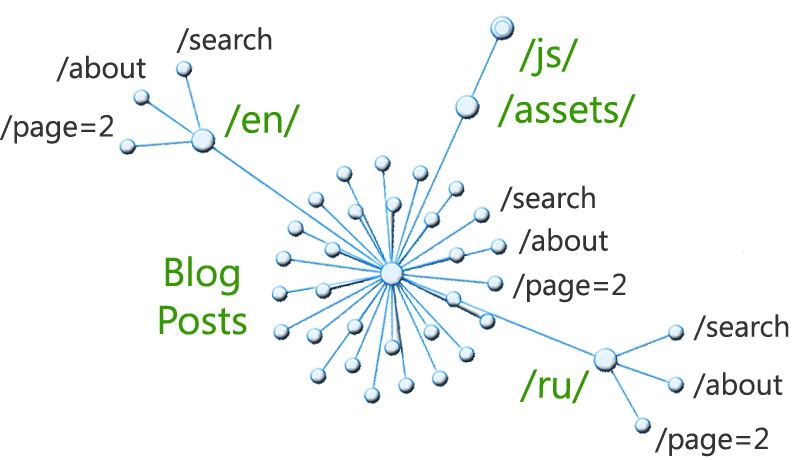
- RarchyApp will scan 50 pages for free, and you can choose different views to visualize the structure. To illustrate this section, I’ve chosen a radial diagram. The outcome is a kind of Directory Tree Visualization: it’s based on the folder structure and doesn’t reflect cross-references between pages. The cheapest subscription would cost you $15.
- Octopus is a popular sitemap tool that visualizes 300 pages for free (or 1000 for paid subscribers) and allows you to add nodes to the created map. That means you can use it as a website planner, too. You can upgrade the plan to Pro for just $8 per month.
- VisualSitemaps grants you 25 site screenshots a month for free and even allows you to set up an automation for this process. The map displays thumbnails of pages and links between them. It’s essential that you can filter some auxiliary subdirectories, such as /assets/, /admin/, etc.
- And lastly, Figma’s sitemap generator and the simplest possible tool, Gloomaps: here you can draw a sitemap yourself. These online tools are helpful at the planning stage of the web development process.

If you need radial crawl diagrams, flow charts with marked depth levels, and complex hierarchical tree graphs, it’s better to turn to big-name SEO crawlers. Screaming Frog Spider, for example, has an excellent guide on crawl visualization. But keep in mind that its free version will allow you to crawl only 500 pages on your site.
If you have more pages, I highly recommend trying interactive crawl maps by another creator, Sitebulb. You can use the full version of their software for 14 days without any crawling limitations. I think the tool deserves a further purchase since you can use it as a full-featured site auditor.
If you want to refresh your knowledge on the site audit or other Tech SEO aspects, please see the related posts below.